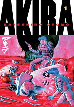
My first exposure to Katsuhiro Otomo came in 1990, when a college boyfriend insisted that we attend a screening of AKIRA at an artsy theater in the Village. I wish I could say that it had been a transforming experience, one that had awakened me to the possibilities of animation in general and Japanese visual storytelling in particular, but, in fact, I found the film tedious, gory, and self-important. Little did I imagine that I’d be reviewing AKIRA nineteen years later, let alone in its original graphic novel format.
I was pleasantly surprised to discover that Otomo’s epic tale works better on the page than it does on the screen, though it’s easy to see why Otomo felt the lengthy motorcycle chases and fight scenes were swell fodder for a movie. Ditto for the setting: what artist wouldn’t want the chance to rebuild a city as complex and ultra-modern as Tokyo from the ground up?
The story, however, demands the more intimate medium of print, as those chases and fights seem urgent and kinetic on the page, an essential tool for drawing the reader into the story, rather than an opportunity for the animators to dazzle audiences with their technical prowess. The story’s setting works better in print as well; the city feels feels more claustrophobic when rendered in black and white than in color. And the story’s length, too, is a factor; the movie compresses over 2,000 pages of material into two hours, trimming some of the manga’s more interesting subplots and secondary characters in order to accommodate the explosions and high-speed chases, and grossly simplifying the relationship between Tetsuo and Kaneda. As in the movie, neither personality is firmly established before Tetsuo begins morphing from juvenile delinquent to god-like psychopath, yet the manga gives each character more room to be, and not just react. As a result, both seem human and vulnerable, more teenage boys than action figures.
The basic plot has held up well. Its paranoid, don’t-trust-the-military vibe seems as resonant in 2009 as it did when the manga was first released in 1982, as does its message about the devastating consequences of WMDs. Watching China prepare for the Beijing Olympics in 2008 — leveling shanty towns, silencing protests — suggested parallels with AKIRA‘s own Olympic subplot, both in the secrecy surrounding the facilities’ construction and in the government’s adamant denial of citizen opposition to the projects.
The artwork hasn’t aged quite as gracefully as the story; it’s the manga equivalent of a mullet, betraying its early eighties roots. Otomo’s backgrounds and weaponry look liked they’ve been traced from The Star Wars Storybook, exuding the same mixture of sterility and rust that was a hallmark of period science fiction, while his characters have thick bodies and pudgy faces, just like the heroes of Tsukasa Hojo’s manga. Yet it’s hard to deny AKIRA‘s visual appeal. Otomo is one of the few artists who can make a chase or an explosion seem like it’s actually happening on the page, thanks to his ability to convey what I call the “geography” of the scene: how big the space is, how high off the ground it is, how far apart the characters are standing. The sound effects are almost superfluous, as Otomo does such a superb job of showing us how the characters move through the space that one can almost hear the whoosh! and vroom! as they fly past.
If you didn’t finish collecting AKIRA when it was still a Dark Horse property, you can round out your set without compromising its appearance on your shelf; the Kodansha edition is virtually identical, save for the logo on the spine. (No, really: it’s the same translation, same trim size, same cover design, and same price as the 2000 version.) And if you haven’t read it yet? Well, now’s your chance to read one of the medium’s greatest sci-fi epics in a nice, oversized package. Recommended.
Review updated on October 5, 2010.

Misty Mays says:
Akira was a great book I read it 2 yrs ago.Its always beeter in the book becuse you can crete your own perception of whats going on in the story.
Rob McMonigal says:
Do you think the differences are enough to warrant a re-reading in the new edition?
Katherine Dacey says:
No — if you’ve invested in the Dark Horse edition, I don’t think the differences are great enough to justify the expense of buying the Kodansha version. (I can’t remember how much the DH version costs, but the Kodansha version is $25.) Both versions are flipped, and both are aiming for a mainstream comic audience. That’s my two cents. Anyone else?
jp says:
I really have to disagree about the art. Akira has an age-proof style that few manga possess; its people look like people (Japanese people, at that!), its backgrounds are dense and interesting, its compositions cinematic, and it’s refreshingly free of boring anime clichés like big ’80s hair/spiky ’90s hair. I only wish more manga demonstrated Otomo’s precise blend of excess and restraint.
Katherine Dacey says:
@jp: Thanks for offering a different perspective on the artwork! If you re-read my comments, you’ll see I’m not dissing it, just noting that Otomo’s aesthetic choices pinpoint AKIRA as a product of the 1980s.
By the way, I love how you characterize Otomo’s artwork as “a precise blend of excess and restraint.” You ought to trademark that phrase so that you receive a royalty every time a critic uses it!
david ford says:
I’m going to have to agree with jp on the art—i think the reason that akira strikes us as so representative of the period has something to do with otomo’s being perhaps the most influential manga-ka of the eighties. i think there is little doubt of the influence of star wars on literally work of science fiction dealing with space that came after it, but at the same time i think there is a grittiness to the imagery that transcends exactly that sterility you mention (which probably stems more from 2001 than star wars).
i also saw the anime long before reading (i too am just coming to akira now), but i’ll be honest, i have little recollection of my response to the film when i saw it maybe 15 years ago. one thing that really jumps out at me about the book is how otomo is able to create an aura of terror of something unseen. this is something that naoki urasawa is really adept at as well (not to mention h. p. lovecraft). the japanese are pretty much unparalleled in terms of their ability to borrow forms and genres from other cultures and turn them into something entirely new and often superior. akira seems to be no exception.
-david
Katherine Dacey says:
David, you’re right that Otomo cast a long shadow over his peers — it IS hard to determine which elements of AKIRA‘s visual style were uniquely his and which were a reflection of period trends. I also agree that Otomo and Urasawa both do a terrific job of using the unseen to scare the bejeezus out of readers. If you check out the review of Domu that I posted last night, you’ll see that was one of the very things I praised in Otomo’s work.
I’m a little hesitant to make sweeping statements about a special Japanese propensity for borrowing forms and genres from other cultures, however; syncretism is one of the defining characteristics of modernism, and one could make an equally persuasive argument that the same is true of American culture. Case in point: the entire history of American music might be summarized using the same language you just used to described AKIRA. If you’re taking more specifically about comics, I’d be much more inclined to agree with you.